I just finished reading the last book in Ursula K. Le Guin's
Annals of the Western Shore series. Well, last published one. I don't know if she plans more.
Some spoilers for the entire series will follow, but I'm not going to bother with a cut tag.
Taken as a whole, the series seems to me to be about two themes. One, slavery in several different forms and two, reading and knowledge.
I think when Americans think of slavery, the first thing that comes to mind is blacks working on Southern plantations. And if we think a bit harder, we might come up with examples from the Bible and Moses leading Egyptian slaves to freedom. And maybe that will lead us to think of Roman slavery. But it probably pretty much ends there. (Or, if we're geeky Americans like myself, we might think of the Tenctonese.) So the books provide for us a different way, actually several different ways, of looking at slavery. And it's even hard for me to explain the different types in each book in a succinct fashion, because Le Guin has done such a great job of creating a number of different rich societies in these books. You might call the first serfs, the second book an occupied city, and the third book something that comes closest to the history of US slavery. But they're all more complicated than that and tied to the notions of family.
As for the reading, that just touches my geeky little heart. And I imagine for any nongeeks who might pick this up, it'll at least touch their bookwormy heart, which is a close relative. The main character in the first book learns to read from his mother, while the rest of the community around him is illiterate and uninterested. The character in the second book, her city is occupied by soldiers to whom books are evil and have been worse than banned, but she learns in secret from the city's hidden cache of books. And the character in the third is living in a literate society in a family who believes in educating everyone, including the slaves. And he is meant to grow up to be the teacher of the next generation of the family's children and young slaves. So you've got an instant bond with all these main characters, as well as stories and knowledge continuing to be a theme throughout all the books.
I liked all the main characters quite well. The second book is the one with a female main character, though, and I ended up rather disappointed by the end of it. One of the problems with first person narration is that your main character needs to be there for everything important, or you'll be reporting things secondhand. And there were a number of times this happened in the book. It wouldn't have been true to the character, perhaps, to have been there as witness, but it was rather annoying to me as a reader to hear her talking about how she heard about this. It put me at a remove, and it took her out of the action. And I just find it particularly problematic because she's the only female lead in any of these books. She's not exactly passive, but the character from the first book who's coming over into this one seems to be playing more of a role in some of the crucial bits. If it wasn't Le Guin, I'd probably be a bit harsher in my criticism, but I do cut her some slack. I have to think she knew what she was doing.. but I just can't figure out why.
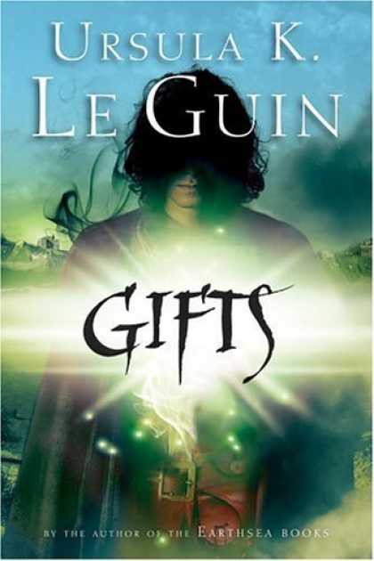
Another odd thing that struck me was skin color. In the first book, I didn't notice much reference to skin color. Was it me not noticing? Not caring? Or was it less of a big deal in that book in particular.. with the next two characters caring about their lineage and appearance a lot more? Did it have something to do with the cover? Because the editions I read, the first cover looked like
this. Two small silhouettes. Whereas the next two books looked like
this (a closeup of a young black woman) and
this (a similar closeup of a black teen boy). No way a white reader can comfortably pretend to not know what color the main character (and everyone else) is.
I noticed that the newer edition of the first book looks like
this (a closeup but with dark hair obscuring more than half the face). This leads me to the conclusion that the publisher wanted all the books to look alike once they had a series on their hands. But that first cover is still odd. You can't see his face. And I couldn't tell you what color he is.
Is this meant to sucker in the white readers? Hey, look, here's a cool book. Oh, now you liked that book? Then you won't mind we put a black girl on the next one, right?
What's going on here exactly?
Me, personally, while I love Memer's hair, it's the cover of the third book that appeals to me the most. Though.. on further thought, it's probably the second book that would stand out the most on a shelf and is probably the one I noticed first. Not that I read them on the basis of the covers, but because I knew they were new Le Guin YA fantasies.
Covers aside, let me conclude this post by highly recommending this series to anyone who likes fantasy, regardless of age. You're allowed to get books out of the YA section, honestly you are. And they're not all about teenage vampire angst. (Though some of them are good too.)
And if you haven't read any Le Guin, well, then.. as good a place to start as any, just so long as you do start!