Realms of Fantasy Covers
Jul. 22nd, 2009 10:11 amI'm going to just focus on the covers and very little of the rest of the discussion going on in multiple venues. And while it may seem I'm picking on Realms... as last year it seemed people were picking on Eclipse... they're basically just good, recent examples to get the discussion going. They're hardly the sole source of the problem.
Looking at the Realms of Fantasy covers here (thanks to![[livejournal.com profile]](https://www.dreamwidth.org/img/external/lj-userinfo.gif) oldcharliebrown for the link) and here (Google images), I took a look at what I liked and didn't like about them.
oldcharliebrown for the link) and here (Google images), I took a look at what I liked and didn't like about them.
The absolutely worst one is Xena, followed close by Harry Potter. They're not advertising what the magazine is about. They're saying 'Like Starlog? Buy me too!' They're giving the impression that it's an sf/f entertainment magazine. And it only very slightly is. It's an original fiction magazine, and those covers don't say that at all. At best they could indicate Xena fanfiction is inside.. except fan magazines would have more interesting Xena-inspired artwork on their covers.
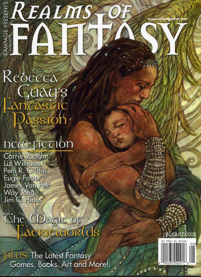
My favorite one (not having seen a full range of all covers, granted) is this one. There's a story there! There's a promise of motherhood, which you don't see all that often in sf/f. I'm not into motherhood as a theme personally, but it's different. And the characters aren't white! And one has wings! I may not like the story that artwork is based on, but at least I know it's going to give me a point of view I don't commonly get. There's even the possibility I read the gender wrong and that's fatherhood on the cover, which would actually be slightly more cool.
I'm also drawn to the covers with dragons on them. Even though the dragons are run-of-the-mill and not quite the style I like, they're still dragons. Love me some dragons. Now, this one doesn't fair well in the smaller size (aka, from further away), but closer up, it's way cool. That's an atypical dragon, hoarding a typical stash of gold, but drinking tea. That dragon says "I look Chinese, but I'm British through and through."
Horses? Eh. Unicorns? Slightly better. People with swords? Been there, done that.
The later covers are prettier (but is that a picture from Watchmen? What the heck?), but not necessarily more appealling to me. Showing me a character without showing me why I should be interested in that character is not going to attract me. Show me some hint of conflict, or plot, or emotion at least.
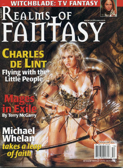
And there's only one thing this one from October 2001 is saying.
So my, admittedly layperson's view is:
1. Don't use movies/TV shows to try to sell magazines. It's lame.
2. When commissioning the artwork, tell the artist to look at the whole story, not just an interesting character in it. Pull out a theme, or a scene. Give us more than a character.
3. Don't be so afraid to have men on the cover.
4. Don't be afraid to toss in some boys and girls as well.
5. When you do have a woman, she doesn't need to be an idealized beauty. Wrinkles are a bonus.
6. Leave out human-esque figures entirely sometimes. We can handle viewing dragons or squid as main characters. And landscape can be cool too.
7. Don't forget the cats.
Oh, hey, this one is pretty cool. Is the secret to have Terri Windling in the issue? She seems to have all the best covers.
Looking at the Realms of Fantasy covers here (thanks to
The absolutely worst one is Xena, followed close by Harry Potter. They're not advertising what the magazine is about. They're saying 'Like Starlog? Buy me too!' They're giving the impression that it's an sf/f entertainment magazine. And it only very slightly is. It's an original fiction magazine, and those covers don't say that at all. At best they could indicate Xena fanfiction is inside.. except fan magazines would have more interesting Xena-inspired artwork on their covers.
My favorite one (not having seen a full range of all covers, granted) is this one. There's a story there! There's a promise of motherhood, which you don't see all that often in sf/f. I'm not into motherhood as a theme personally, but it's different. And the characters aren't white! And one has wings! I may not like the story that artwork is based on, but at least I know it's going to give me a point of view I don't commonly get. There's even the possibility I read the gender wrong and that's fatherhood on the cover, which would actually be slightly more cool.
I'm also drawn to the covers with dragons on them. Even though the dragons are run-of-the-mill and not quite the style I like, they're still dragons. Love me some dragons. Now, this one doesn't fair well in the smaller size (aka, from further away), but closer up, it's way cool. That's an atypical dragon, hoarding a typical stash of gold, but drinking tea. That dragon says "I look Chinese, but I'm British through and through."
Horses? Eh. Unicorns? Slightly better. People with swords? Been there, done that.
The later covers are prettier (but is that a picture from Watchmen? What the heck?), but not necessarily more appealling to me. Showing me a character without showing me why I should be interested in that character is not going to attract me. Show me some hint of conflict, or plot, or emotion at least.
And there's only one thing this one from October 2001 is saying.
So my, admittedly layperson's view is:
1. Don't use movies/TV shows to try to sell magazines. It's lame.
2. When commissioning the artwork, tell the artist to look at the whole story, not just an interesting character in it. Pull out a theme, or a scene. Give us more than a character.
3. Don't be so afraid to have men on the cover.
4. Don't be afraid to toss in some boys and girls as well.
5. When you do have a woman, she doesn't need to be an idealized beauty. Wrinkles are a bonus.
6. Leave out human-esque figures entirely sometimes. We can handle viewing dragons or squid as main characters. And landscape can be cool too.
7. Don't forget the cats.
Oh, hey, this one is pretty cool. Is the secret to have Terri Windling in the issue? She seems to have all the best covers.
(no subject)
Date: 2009-07-23 12:34 am (UTC)(no subject)
Date: 2009-07-23 06:13 am (UTC)But... now that I look at it more, I'm not sure my aesthetic response is to the dragon itself. It might be to the eye-watering combination of fonts on that cover. There's the title font, the courier, and the faux-celtic whose capital letters and lower-case don't go together at all, and they may be making me project a small wince onto the poor innocent dragon.
So now I really want to see the cover without the text.
Yay!
Date: 2009-07-23 06:16 am (UTC)Also, I wouldn't have seen that gorgeous mother-and-child if you hadn't pointed it out. Wow. (I think the angle of the spine says it's got to be a female character. Nobody draws a male spine at that angle unless there's a sword at his throat *grins*)
Re: Yay!
Date: 2009-07-24 03:38 pm (UTC)* Am I thinking it's a woman because it's holding a child?
* Am I thinking it's a woman because of the jewelry and flowing clothes? Clearly a cultural bias on my part.
* Am I thinking it's a woman because of the long hair? That's just silly, but..
* Am I uncertain by looking solely at the face because I grew up looking at white faces and haven't picked up all the gender cues of a non-Caucasian face?
* Is it the facial expression?
* Is it the muscular arm that's giving me pause?
I didn't even consider the spine.
Also...
Date: 2009-07-24 10:34 am (UTC)Silly Shweta.
Re: Also...
Date: 2009-07-24 03:28 pm (UTC)Thanks.